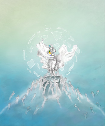
Malm (2014-2015)
A downloadable game for Windows and macOS
In September 2014, I began working on my graduation project. This time, I aimed to design a game built around a system — something more strategic, like chess — rather than a linear experience like The Free Project or Cover Me.
While the project ultimately didn’t succeed, it became a valuable learning experience. I documented every prototype and gathered them into this virtual ‘museum.’ You can explore freely or follow the guided path that walks you through my design process.
--------------------------------------------------------------------------------------------------
A Short Reflection: Two Lessons for Game Developers
Through this project, I learned two key lessons that I believe could benefit other developers:
Start with Aesthetics, Not Mechanics
One of my biggest hurdles was following the Mechanics-Dynamics-Aesthetics (MDA) Framework too rigidly. This framework suggests that games are built from the ground up: mechanics create dynamics, and aesthetics are layered on top as a finishing touch. Believing this was the path to designing a solid system (rather than a linear experience like The Free Project or Cover Me), I focused on crafting mechanics first and left aesthetics for last.
I now realize that this approach, while academically sound, isn’t always practical—especially for expressive or artistic games. Mechanics like jumping, clicking, or moving are abstract without context. It’s the world—its animations, colors, sounds, and narrative—that gives those mechanics meaning.
For example, knowing a character has no arms instantly shapes how they move, behave, and interact with the world. That constraint inspires unique mechanics tied to the character's identity. Designing purely with placeholders leads to generic systems, while starting with aesthetics gives your mechanics personality, direction, and emotional resonance.
The Player Creates the Composition
Every creative process hits moments of uncertainty. When I got stuck, I defaulted to overthinking and expanding the concept—adding more objects, more rules, more features. I treated game design like theatre dramaturgy, where creators carefully compose every element on stage to guide the audience’s understanding through structure and cues.
This works well for linear experiences, where the designer controls pacing and meaning—just like in theatre. But with systemic games, the dynamics emerge from player decisions. The designer doesn’t control the composition; the player does.
By constantly adding elements, I made the system overly complex and chaotic. I hadn’t yet grasped that in non-linear games, simplicity and clarity are key. When players are building their own experiences through interaction, too many variables can overwhelm and confuse.
Looking back, instead of endlessly refining the concept whenever I felt stuck, I should have focused on finishing the game, then observing how players interacted with the system. Meaning emerges through play, even if I didn’t fully define it beforehand.
These lessons—leading with aesthetics and trusting the player to create meaning—have reshaped how I approach game design today.
| Status | Released |
| Platforms | Windows, macOS |
| Author | Charlotte Madelon Design |
Download
Click download now to get access to the following files:


Leave a comment
Log in with itch.io to leave a comment.